Responsibilities: market research | UX Research | UI Design
itzhaki flowers
e-commerce website re-design
Role: UX/UI Designer
Responsibilities: market research | UX Research | UI Design
itzhaki flowers
A project to re-design the website for Itzhaki Flowers, a well-established local flower shop located in the Sharon area, Israel. Despite having an existing website, the online experience failed to convert.
my role in this project:
market research
UX research
wireframes
UI design
The Pain
Despite having an existing website, the online experience failed to convert - with very low online sales and over
Cart Abandonment
0%
The client approached us with a clear goal:
Increase online sales and improve the overall shopping experience
Goals
Reduce cart abandonment
Improve product discoverability
Build user trust and credibility
Modernize the visual and UX design
Support SEO and mobile responsiveness
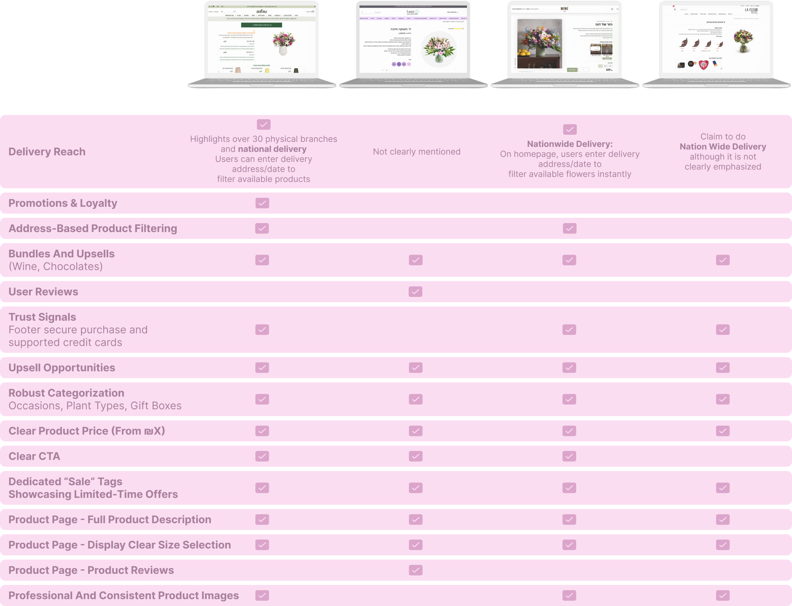
Research & Analysis
We conducted a UX audit of the existing website and identified several key pain points:
Lack of visual hierarchy and CTA clarity
No promotional banners or seasonal offers
Poor product categorization and redundant UI elements
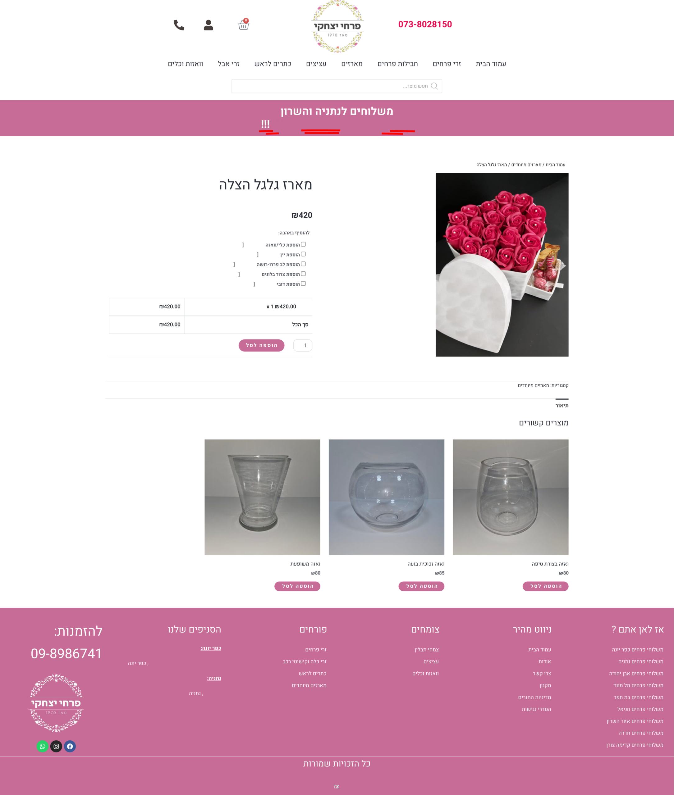
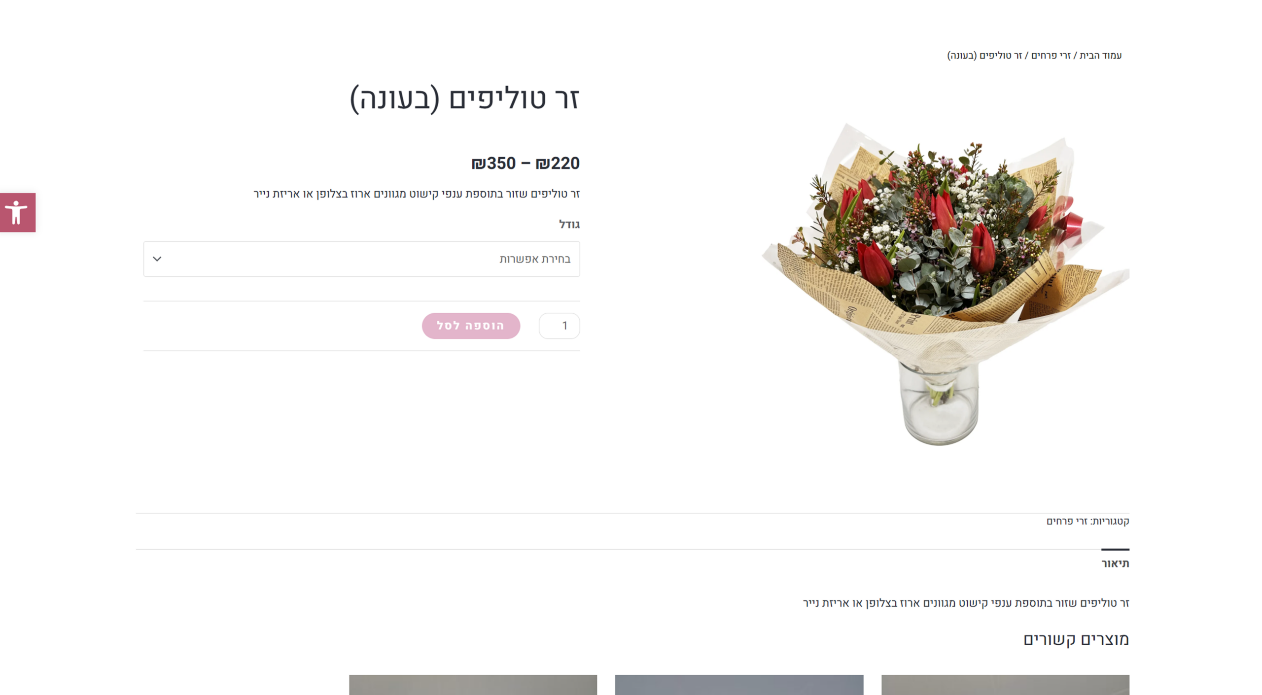
Unclear pricing - confusing ranges without “starting from”
No social proof (reviews, testimonials)
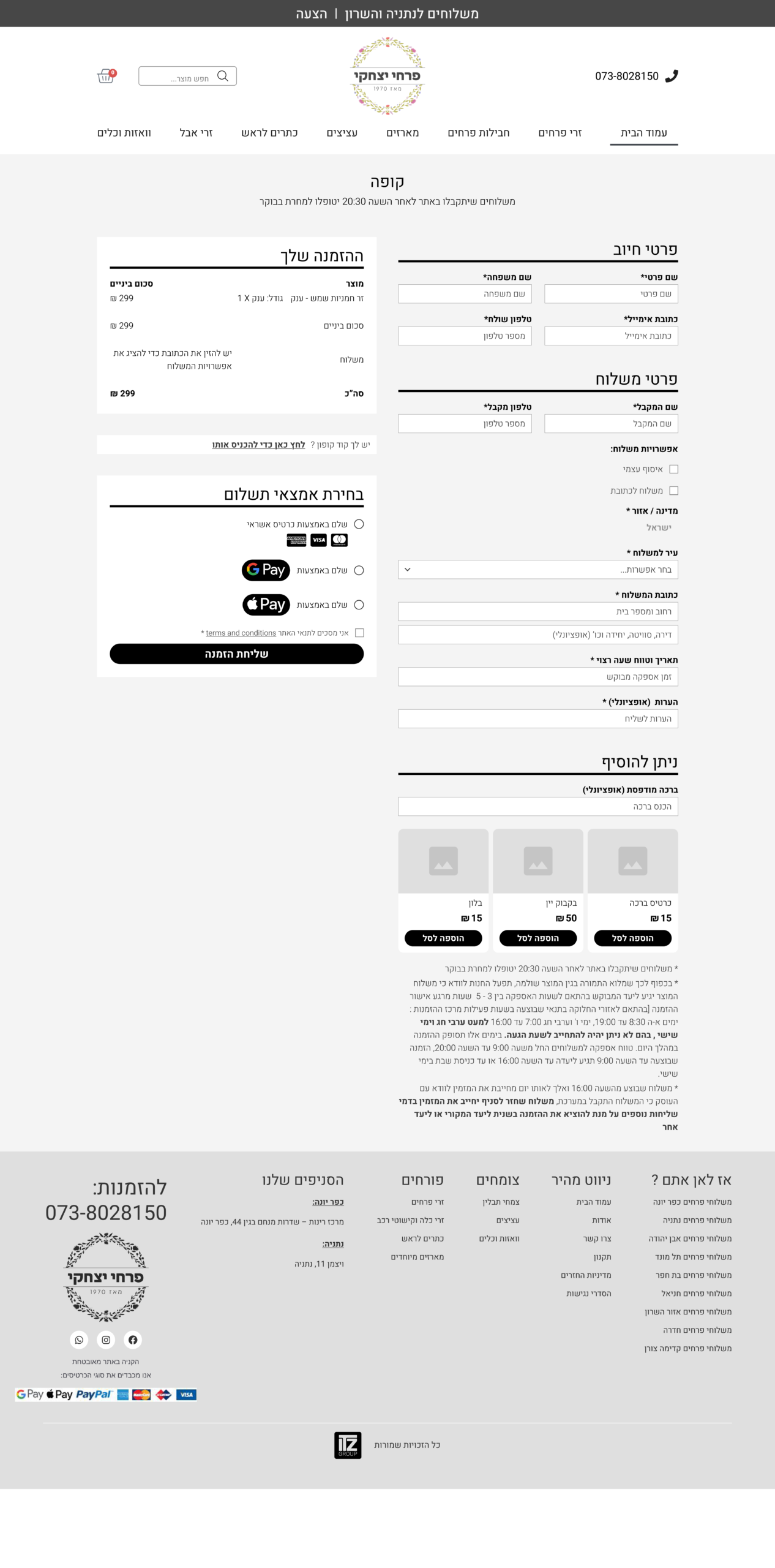
Cumbersome checkout flow with too many fields with no clear hierarchy
No trust signals (e.g., secure payment badges)
Non-uniform and poor quality product images that also did not contribute to brand visibility and confidence
Product pages with no description or insufficient description - reduced user confidence and understanding of what they were getting, in addition to a lack of SEO and reduced product visibility to search engines
Lack of appropriate tags for related products, so that product page up-sale offers were not for appropriate complementary products
Features
We benchmarked competitors to understand local flower shops best practices
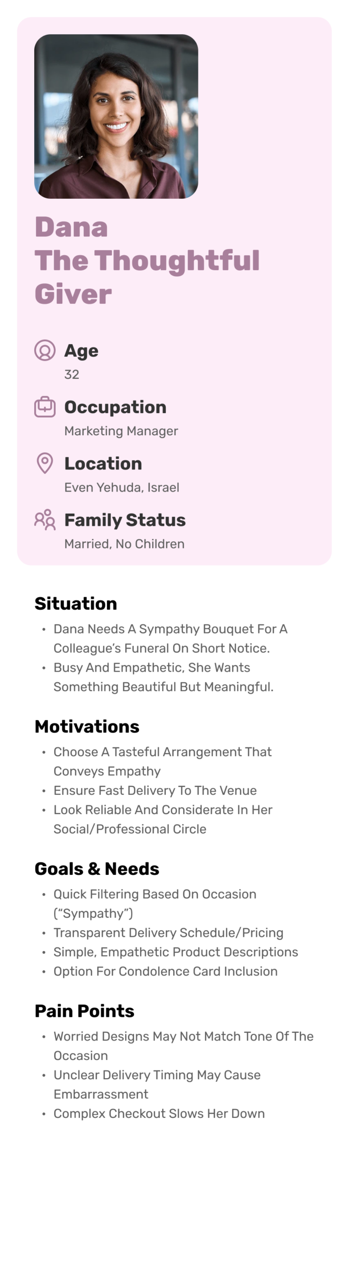
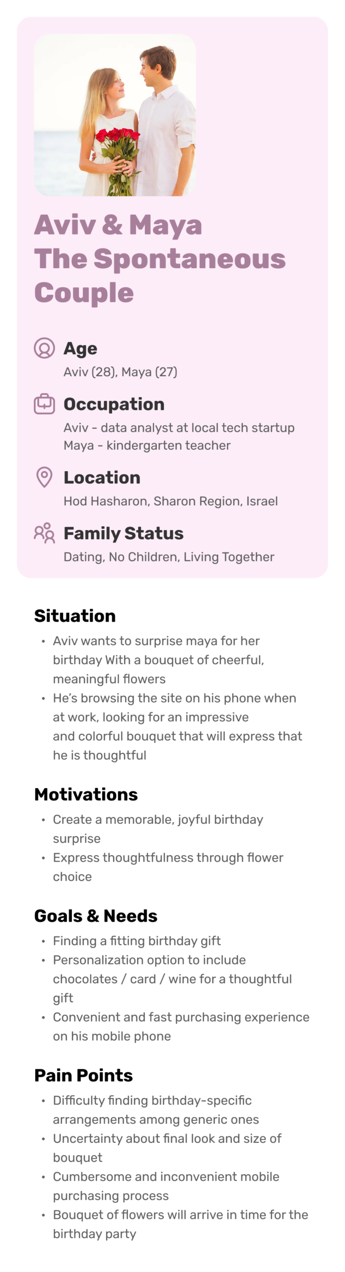
Focus from Personas
These personas helped us direct specific product features, flows, and messaging to better resonate with our target users and ultimately drive conversion
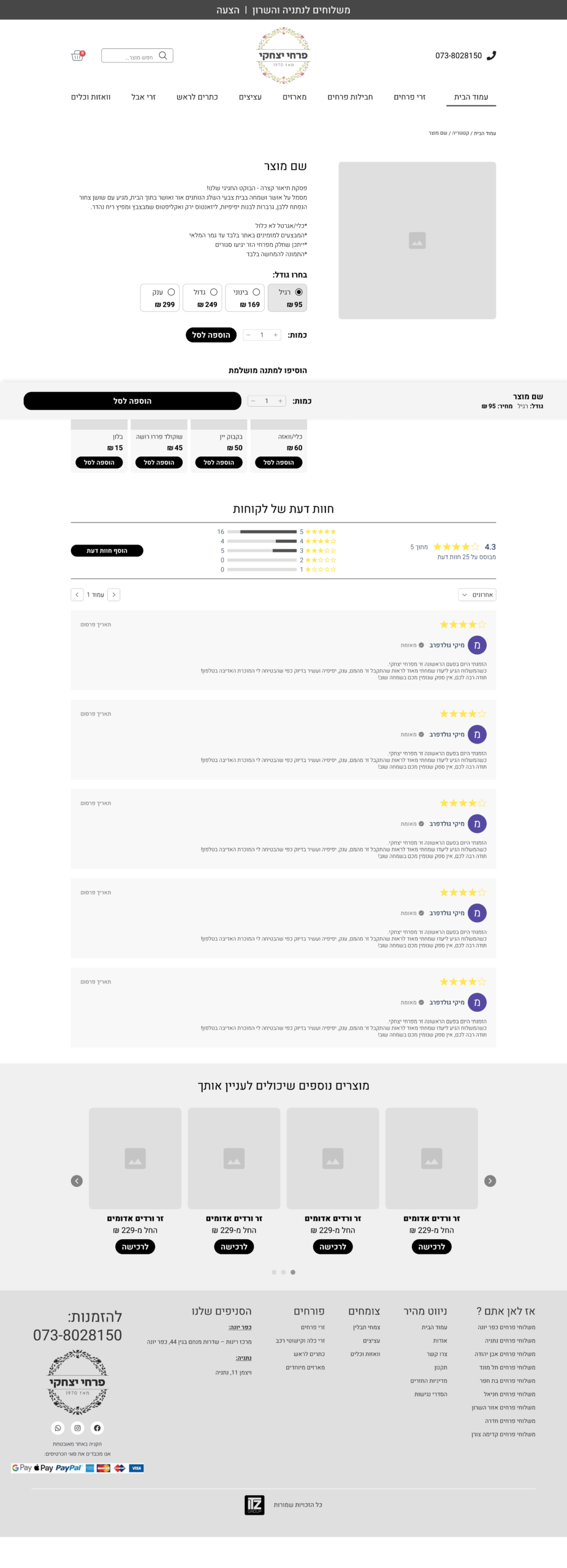
UX Improvements Implemented
From the research & analysis, here are highlights of our re-design process:
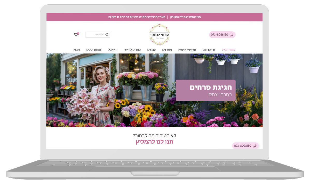
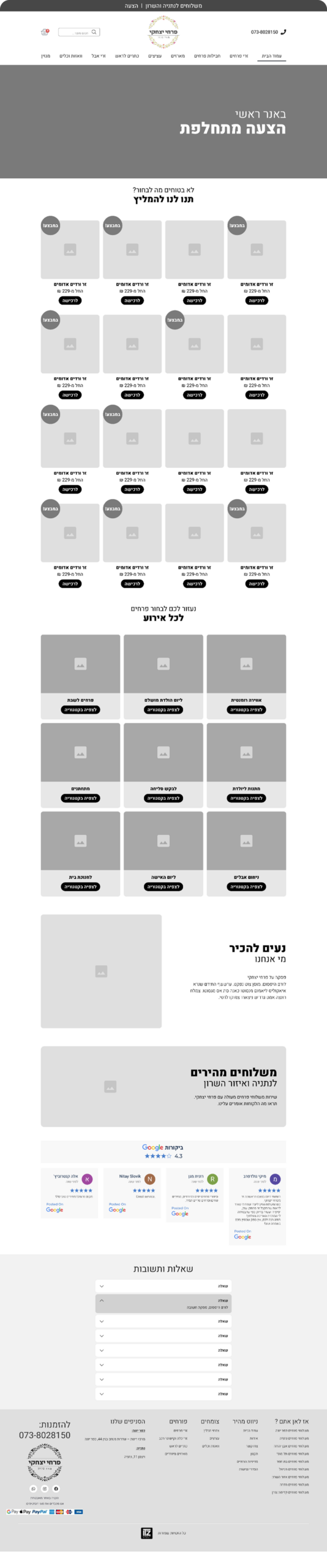
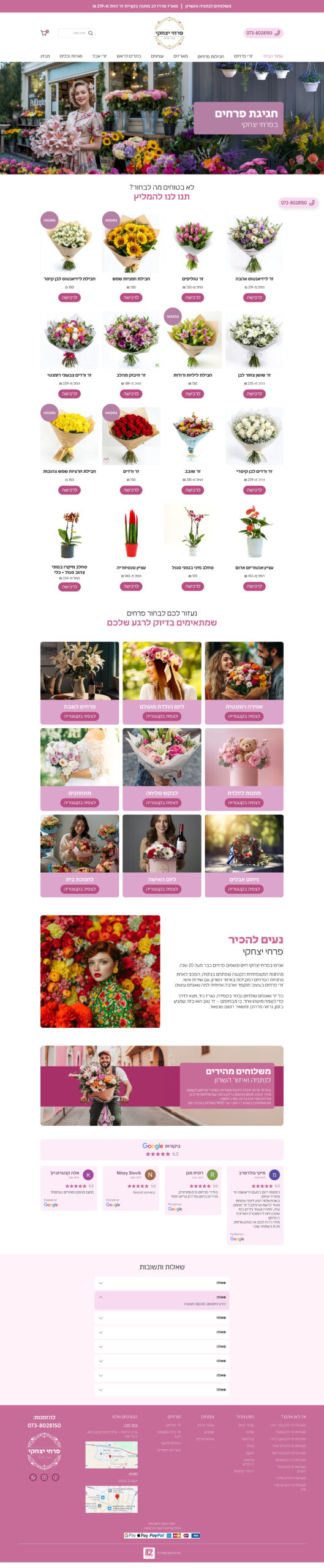
Homepage:
Introduced a main visual banner with rotating offers
Adding a recommended products section to promote selected products, promote sales, and improve the discoverability of popular products right on the home page
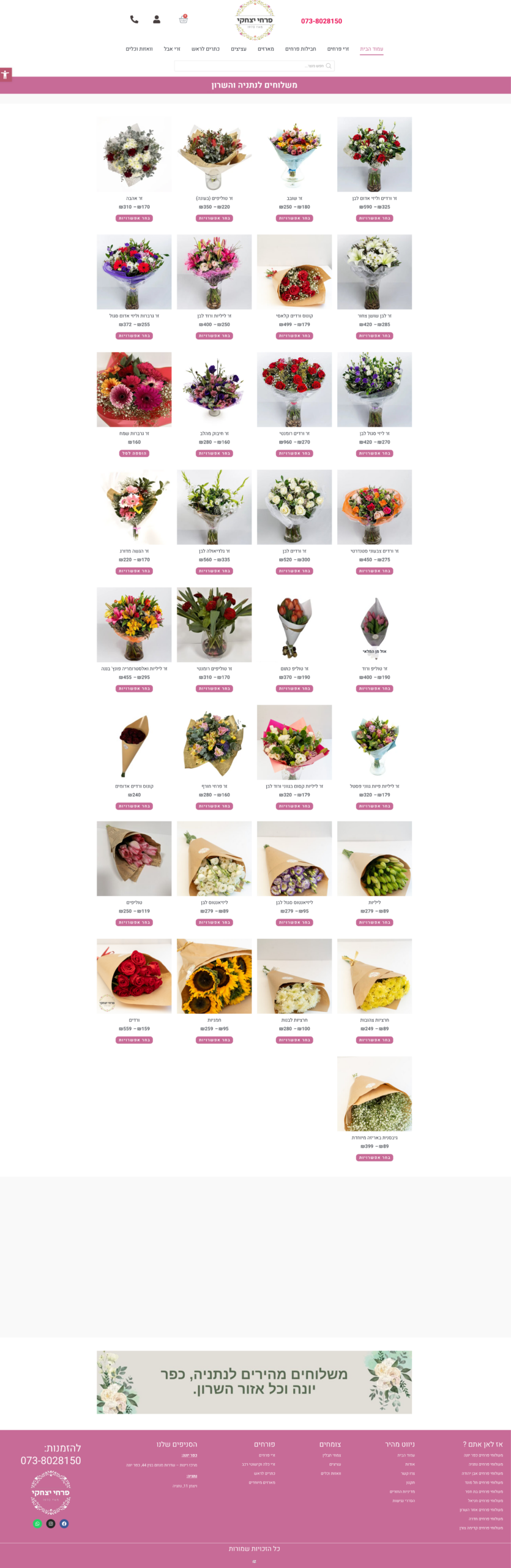
Organized products by occasion (birthdays, romance, apologies, etc.)
Integrated customer reviews
Highlighted local delivery areas for trust and clarity
Added FAQ section for hesitation reduction and SEO